Creating a Logo for a Cantonese Language Group
Project Type: Logo design
Role: Designer
Tools: Illustrator, Procreate
Timeline: November 2022
Overview
The Cantonese Alliance is a community-driven organization dedicated to preserving the Cantonese language and promoting its education. Their mission is to connect Cantonese teachers, learners, and parents in a shared effort to sustain the language for future generations. The Alliance was seeking a new logo to represent their identity across key platforms, including their website, newsletter, and Discord channel.
Goal
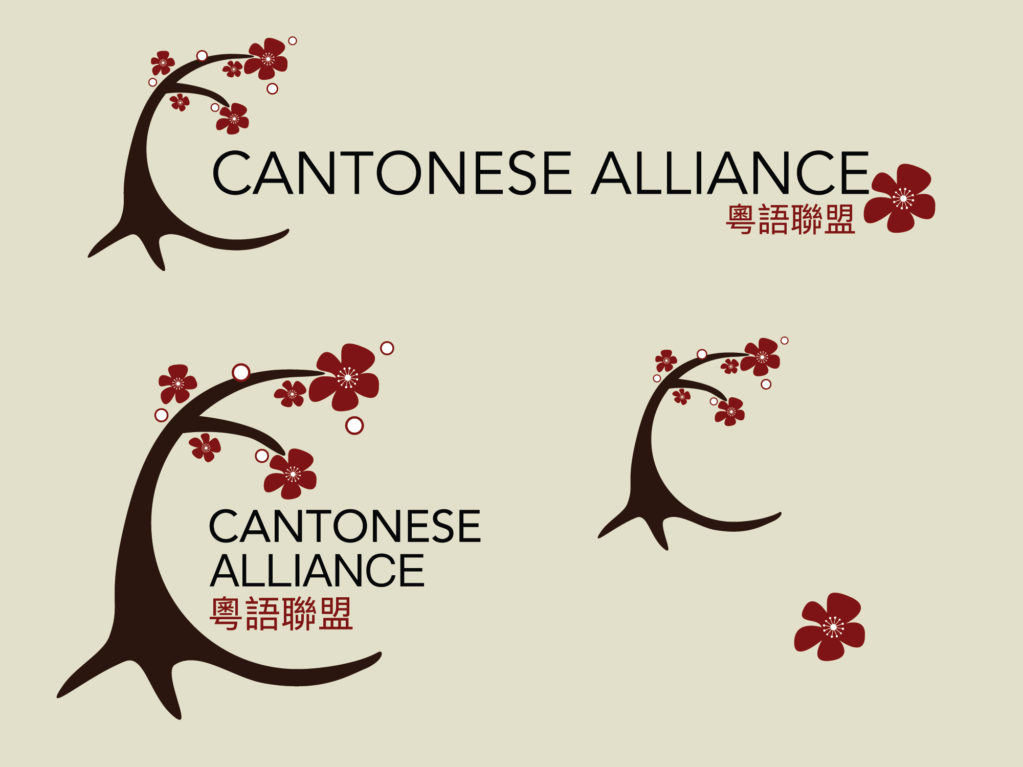
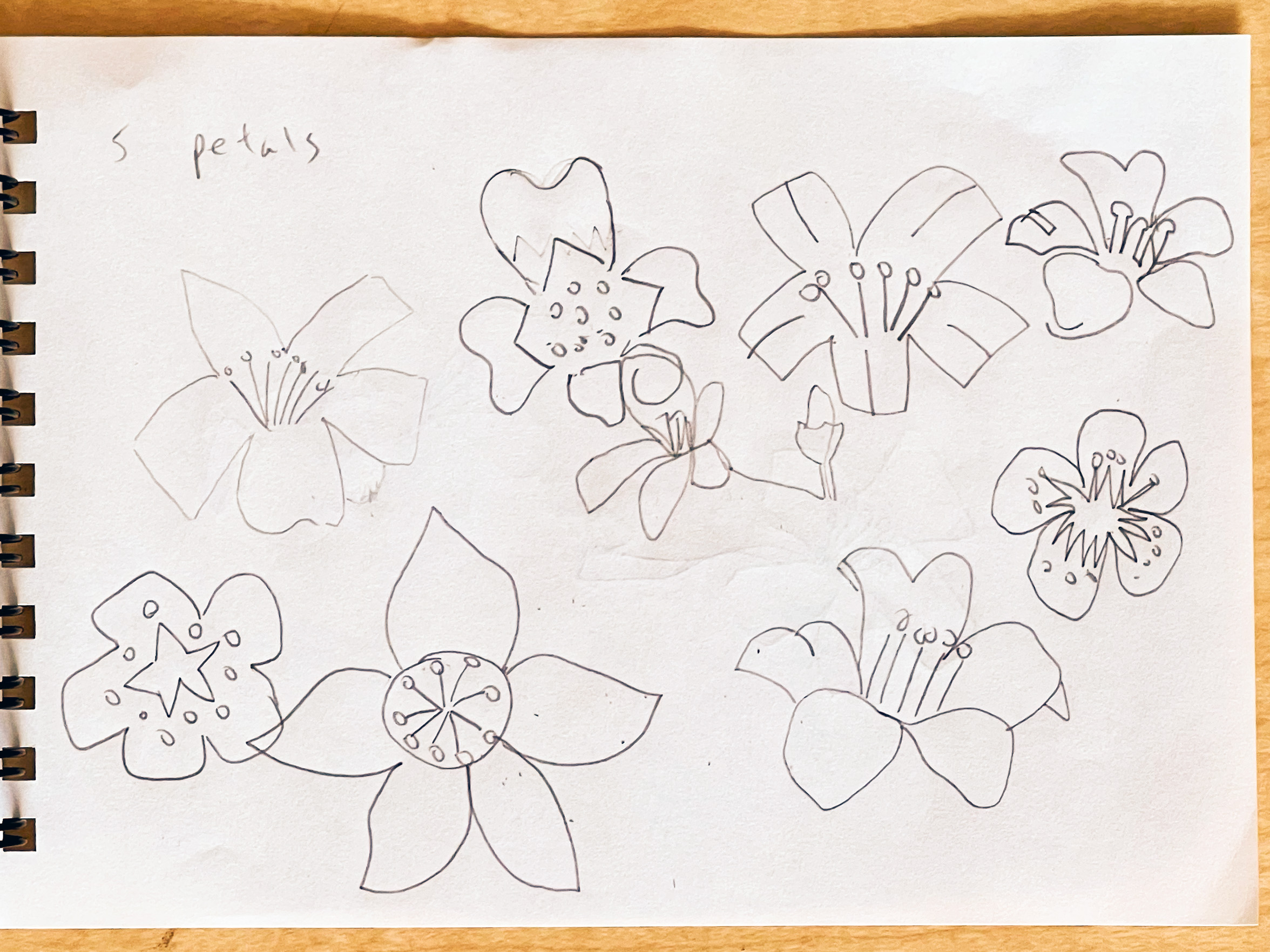
The group's founder envisioned a tree motif to align with the visual identity of other affiliated organizations. We chose the Red Silk Cotton Tree, a species native to Hong Kong and known for its striking red blossoms. Its seed pods release cotton-like fibers that are carried far by the wind, serving as a powerful symbol of the Chinese diaspora.
Concept #1:
Minimalistic representation of the Red Silk Cotton Tree flower

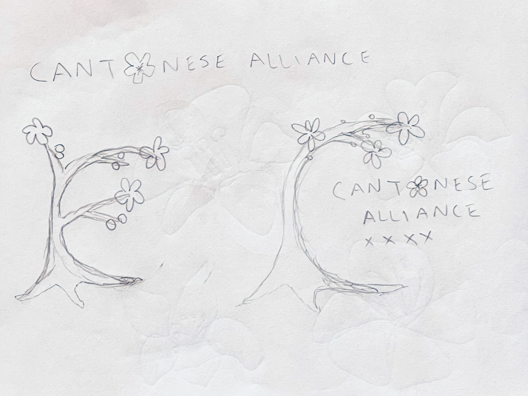
Concept #2:
A Red Silk Cotton Tree stylized in the shape of the letter "C" to represent "Cantonese"
This concept was selected as the final direction, with a few design notes: the red cotton pods should be changed to white, and the flowers currently resemble cherry blossoms too closely and need to be differentiated.
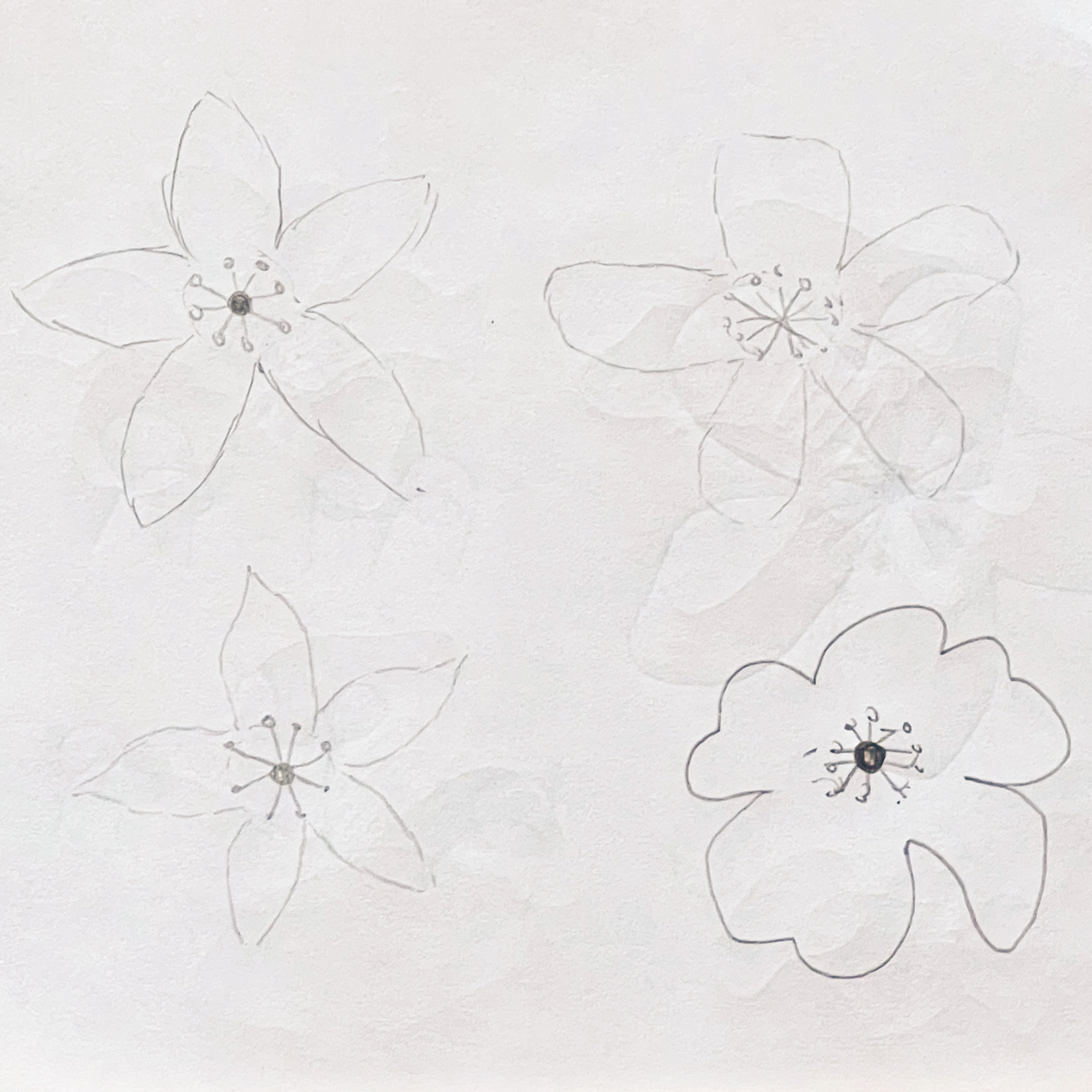
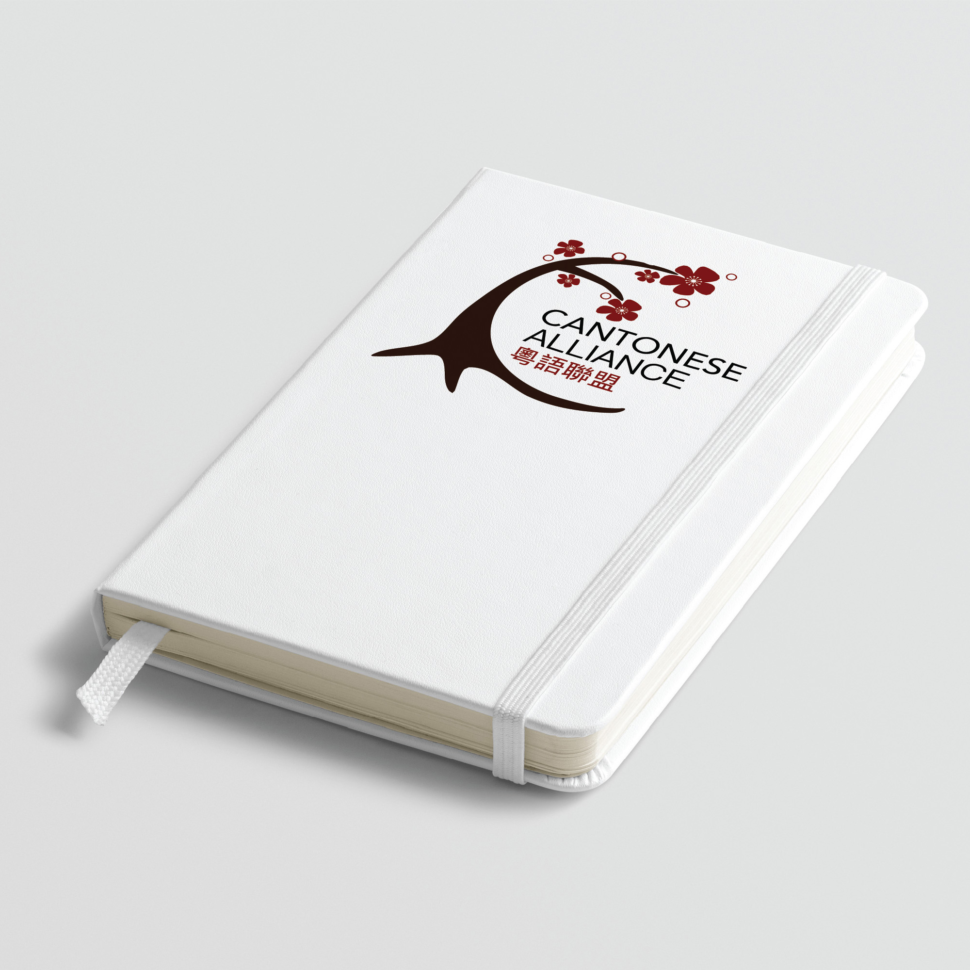
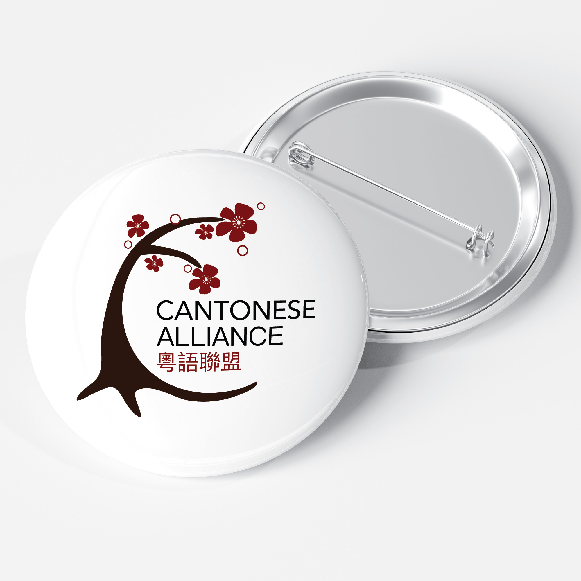
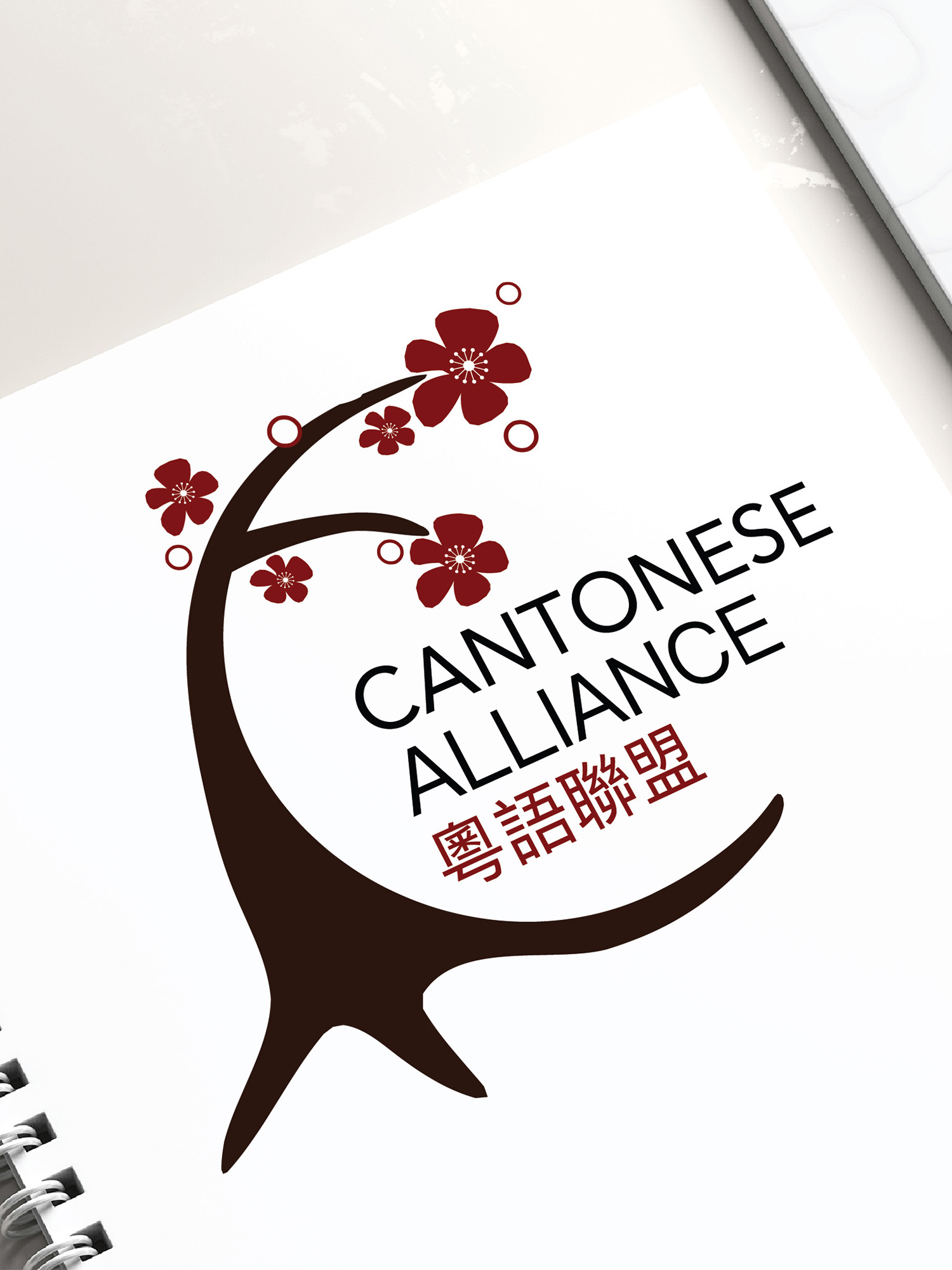
Final Design