Building a Brand Identity for a Kids' App Company
Project Type: Brand Identity
Role: Designer
Tools: Illustrator, Photoshop
Timeline: Spring 2025
Overview
Chopstik Scholars is an edtech startup creating STEAM-based apps for preschool and elementary-aged children, with a focus on homeschooling families. As a new player in the education space, Chopstik Scholars sought a distinctive logo and cohesive branding system that would reflect their playful, forward-thinking mission while appealing to both young learners and their parents.
At Chopstik Scholars, we believe that children learn best when they're having fun and being challenged. Our core values are creativity, exploration, and deep understanding, and we want children to feel excited and inspired by learning.
Standing Out in a Crowded Market
Problem
With countless digital tools competing for attention, parents often feel overwhelmed and unsure about which ones genuinely support their child's learning journey.
Meeting Parent Expectations
Parents are looking for more than just educational content, they
want tools that are safe, engaging, and provide a healthy balance
between learning and screen time.
Appealing to Two Audiences
The brand needed to connect with both children and parents, capturing
kids' sense of fun and adventure while building trust and confidence
among adults.
Balancing Tone and Personality
The branding had to strike a careful balance: playful and imaginative
without being overly childish, and professional without feeling
too academic or formal.
Engaging Kids, Reassuring Parents
Goal
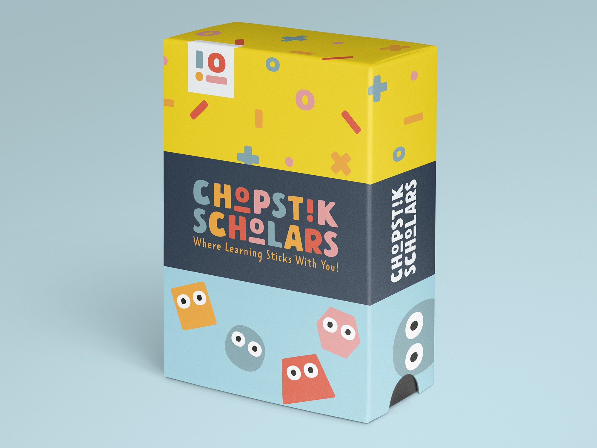
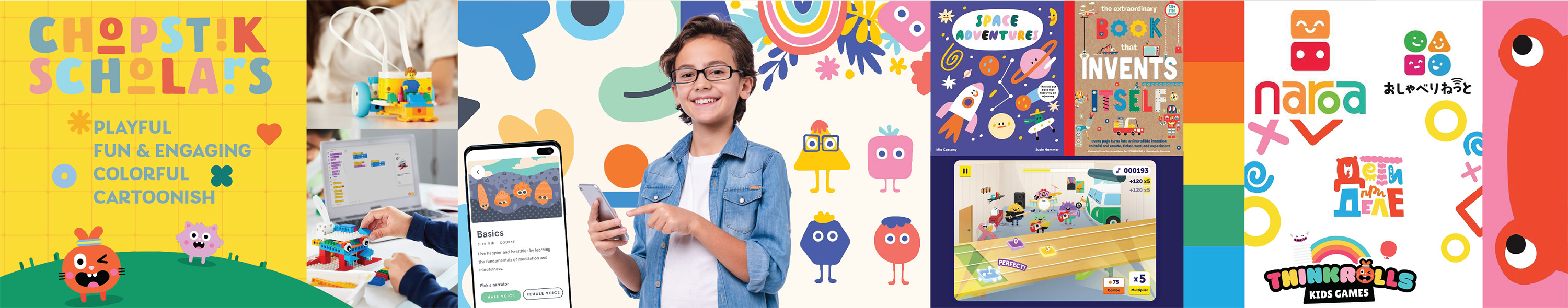
The goal was to create a logo and brand identity that captures children's attention with playful visuals, while resonating with parents through trust and educational value. The identity balances fun with professionalism, using vibrant colors and STEAM-inspired details to reflect the brand's quirky personality, hinted at by the intentional misspelling of “Chopstik,” and establish a visual system that can grow with the company.
Building the Wonder Toolkit
Research
Visual research was conducted to gather colors, fonts, imagery, and textures that would define the brand’s vision. These elements were curated in a stylescape titled “The Wonder Toolkit”, featuring bright primary colors, rounded fonts, and cartoon illustrations.
This formed the foundation for an identity that is:
- Playful yet refined
- Imaginative and adventurous
- Trustworthy and educational
Exploring Visual Directions
Ideas
The logo explorations focused on playful, approachable design using rounded typography and cartoon elements. Initial concepts were presented in black and white to refine form and readability before introducing bright, kid-friendly colors.
Concept #1
Concept #2
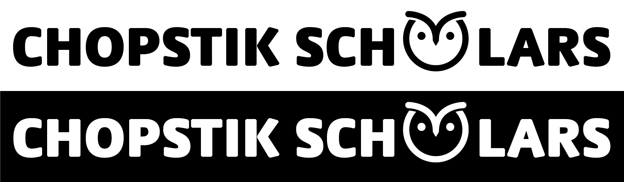
Concept #3
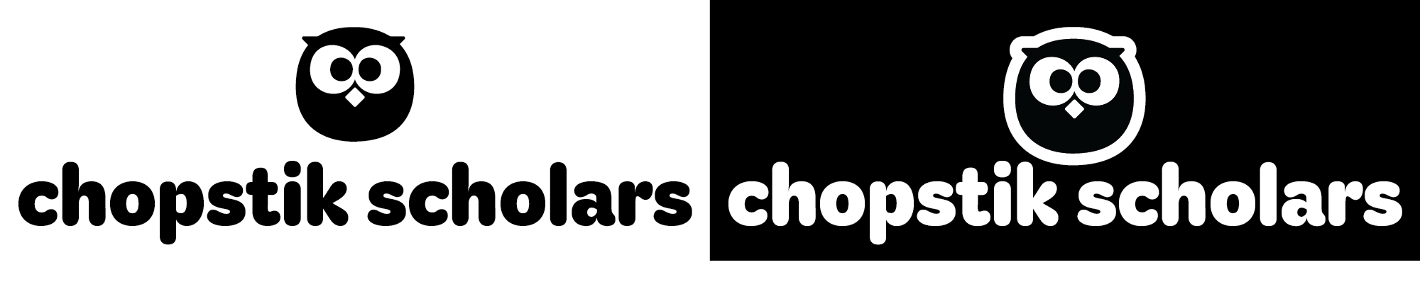
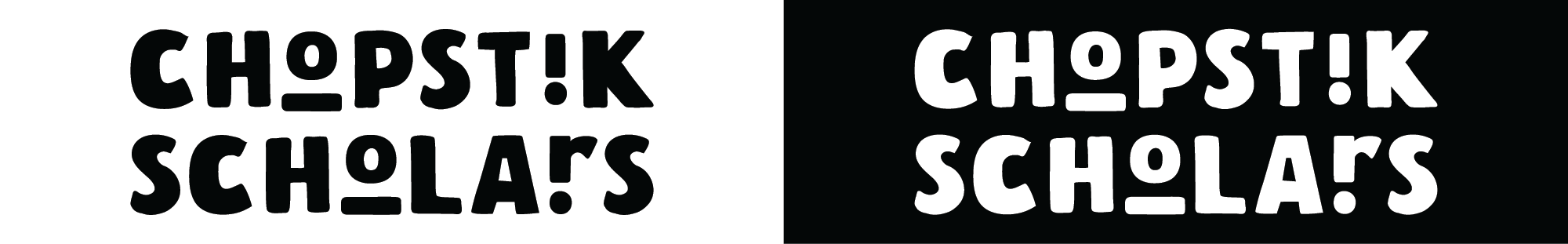
Playful Letters with a Purpose
Final Design
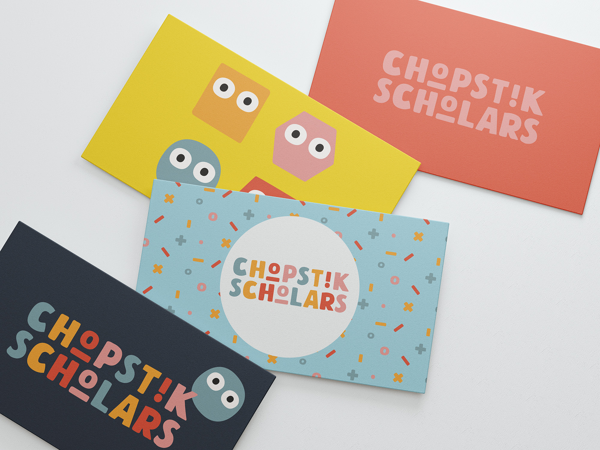
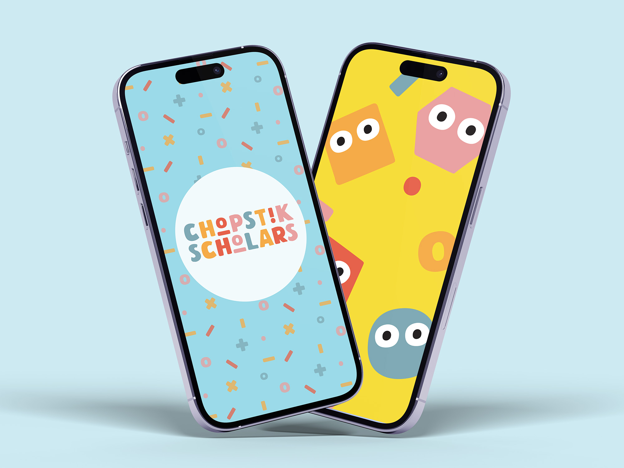
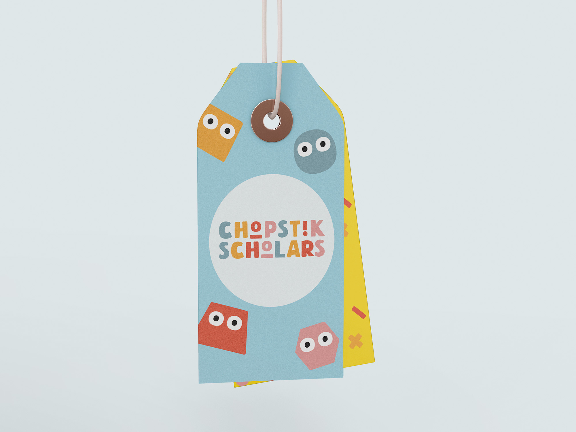
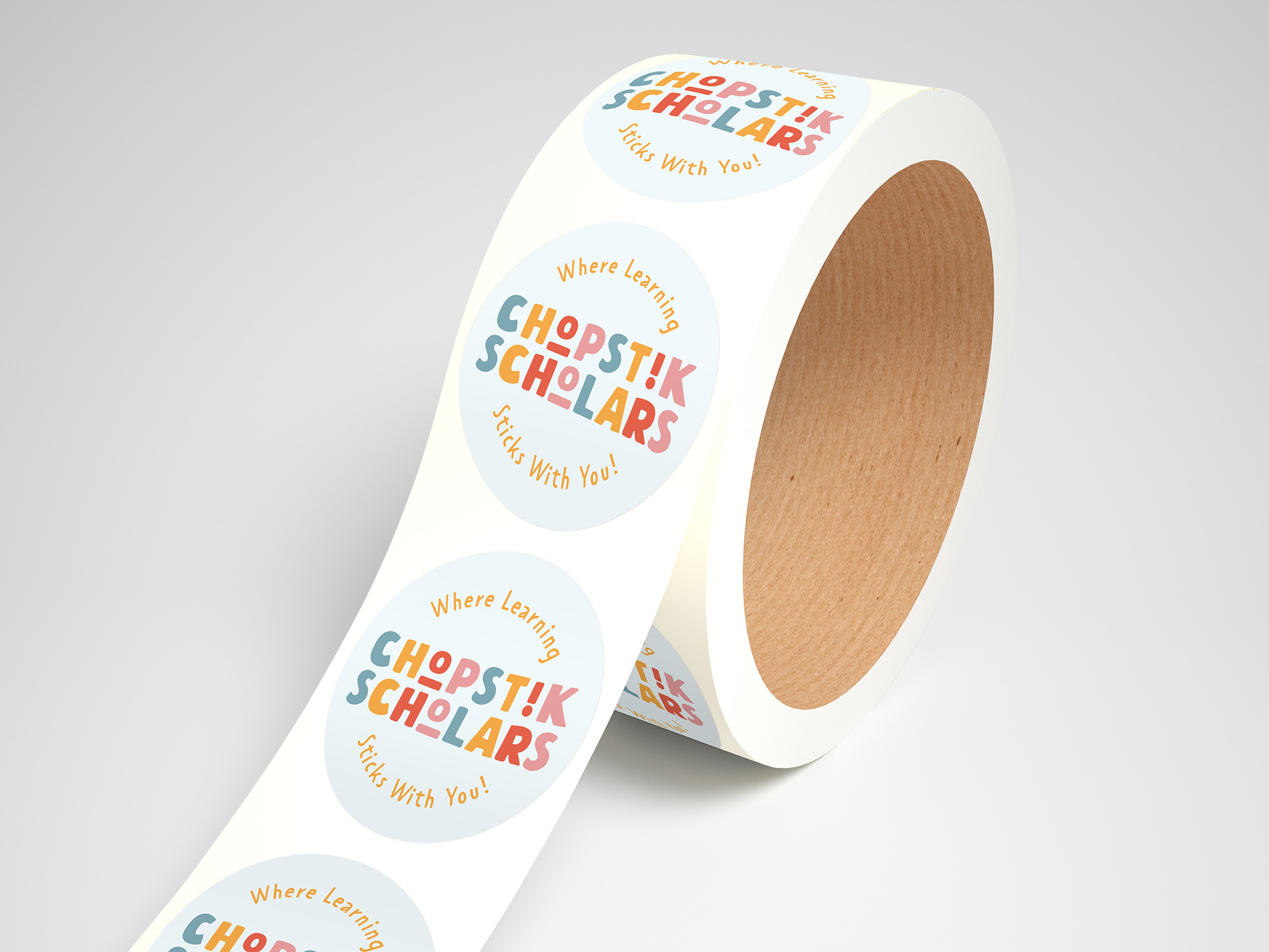
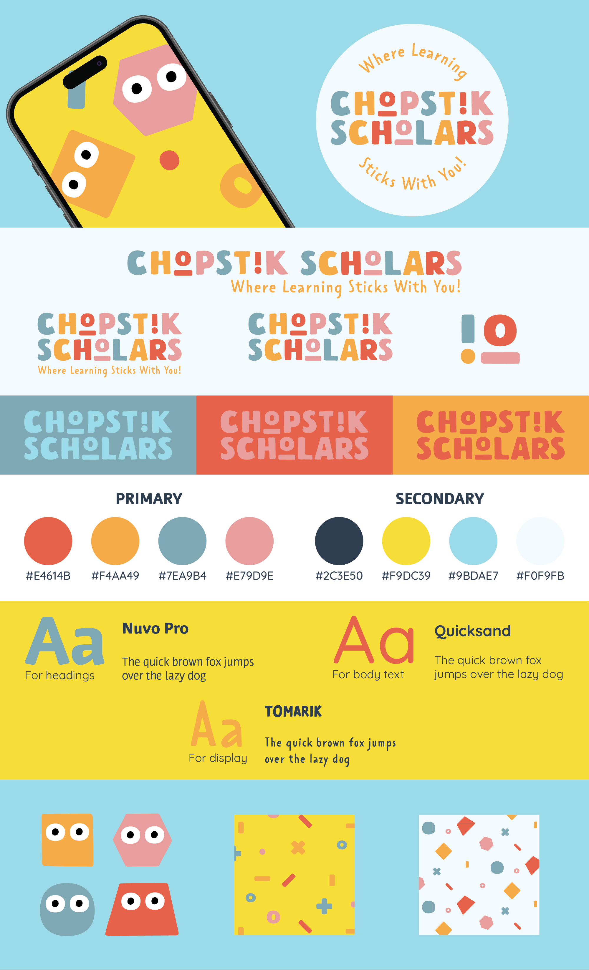
The final design features a wordmark in a friendly, hand-drawn font with playful letter embellishments that add personality and a sense of fun. Alternating colors in each letter create a vibrant, rainbow effect.

Submark
The submark pulls the embellished “i” and “o” from the main logo,
resembling chopsticks or an open book—symbols of learning and
exploration. They also subtly reference “input/output,” tying
into the brand's STEAM focus.
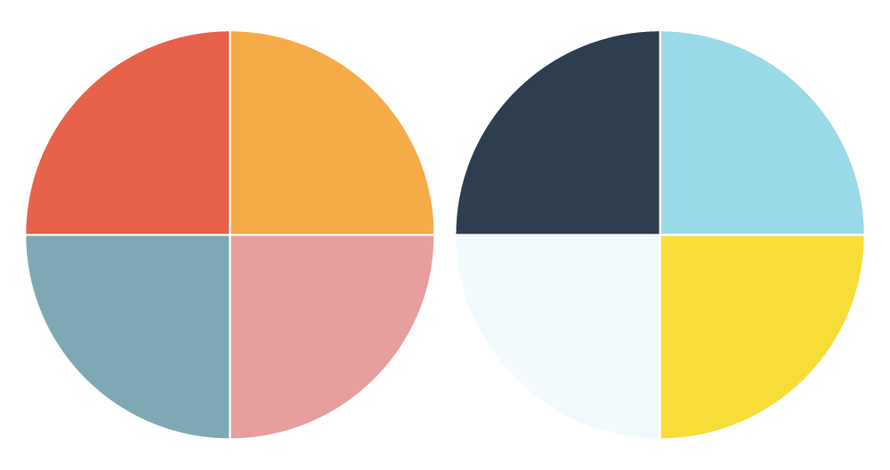
Colors
The secondary colors palette was selected to complement the bright
primary colors from the logo, with an emphasis on shades of blue.
Blue is associated with trust, intelligence, and calm, reinforcing
the brand's educational focus.
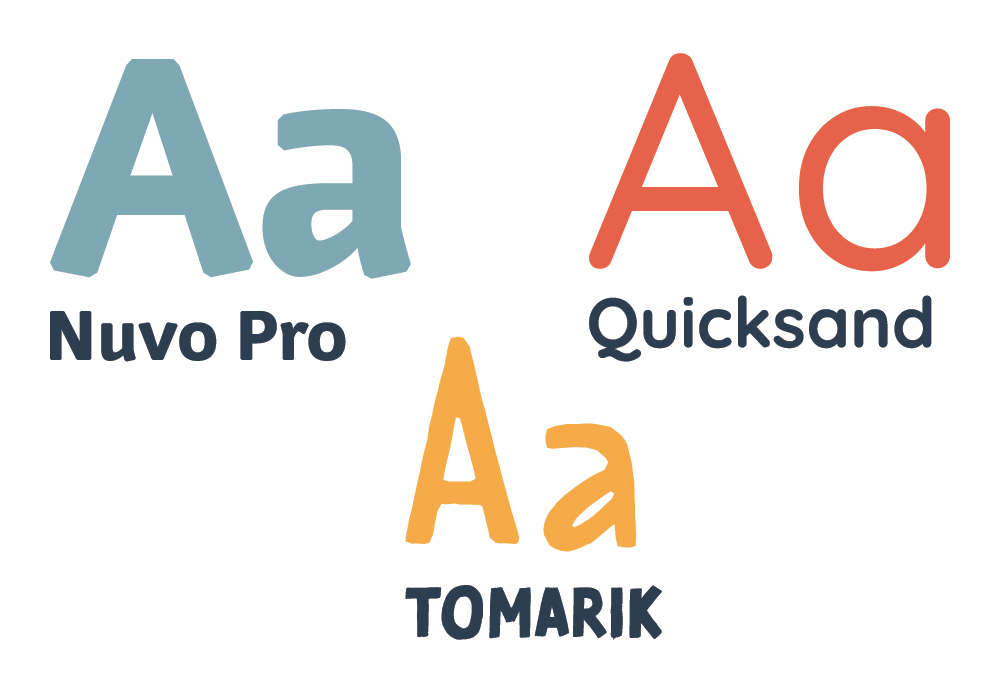
Typography
The typography system blends Nuvo Pro, Quicksand, and Tomarik
to balance clarity with playfulness.
- Headers: Nuvo Pro's bold, modern letterforms feel strong yet friendly.
- Body: Quicksand's rounded sans-serif offers a soft, playful tone.
- Display: Tomarik adds a whimsical, hand-drawn accent for flair.
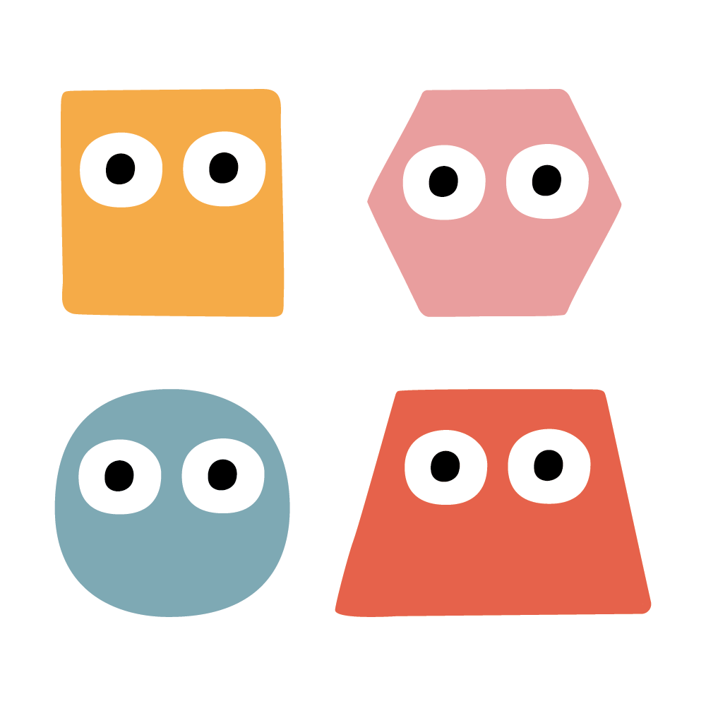
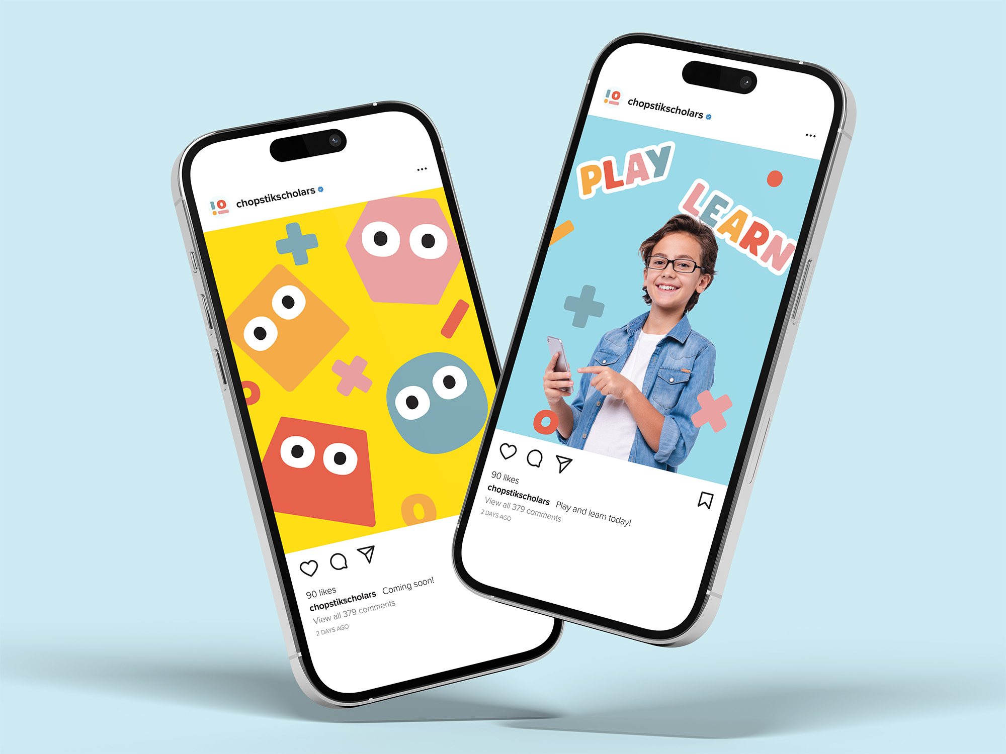
Mascots
The mascots are minimalist characters made from geometric shapes,
appealing to children while subtly referencing STEAM concepts
like geometry and pattern recognition.
Brand Style Guide
Shapes, Colors, and Characters That Stick
Visual Identity
The visual identity showcases a colorful, playful wordmark applied across various mockups, from digital screens to print materials. Each application highlights the brand's balance of fun and professionalism, ensuring it resonates with both kids and parents in every context.